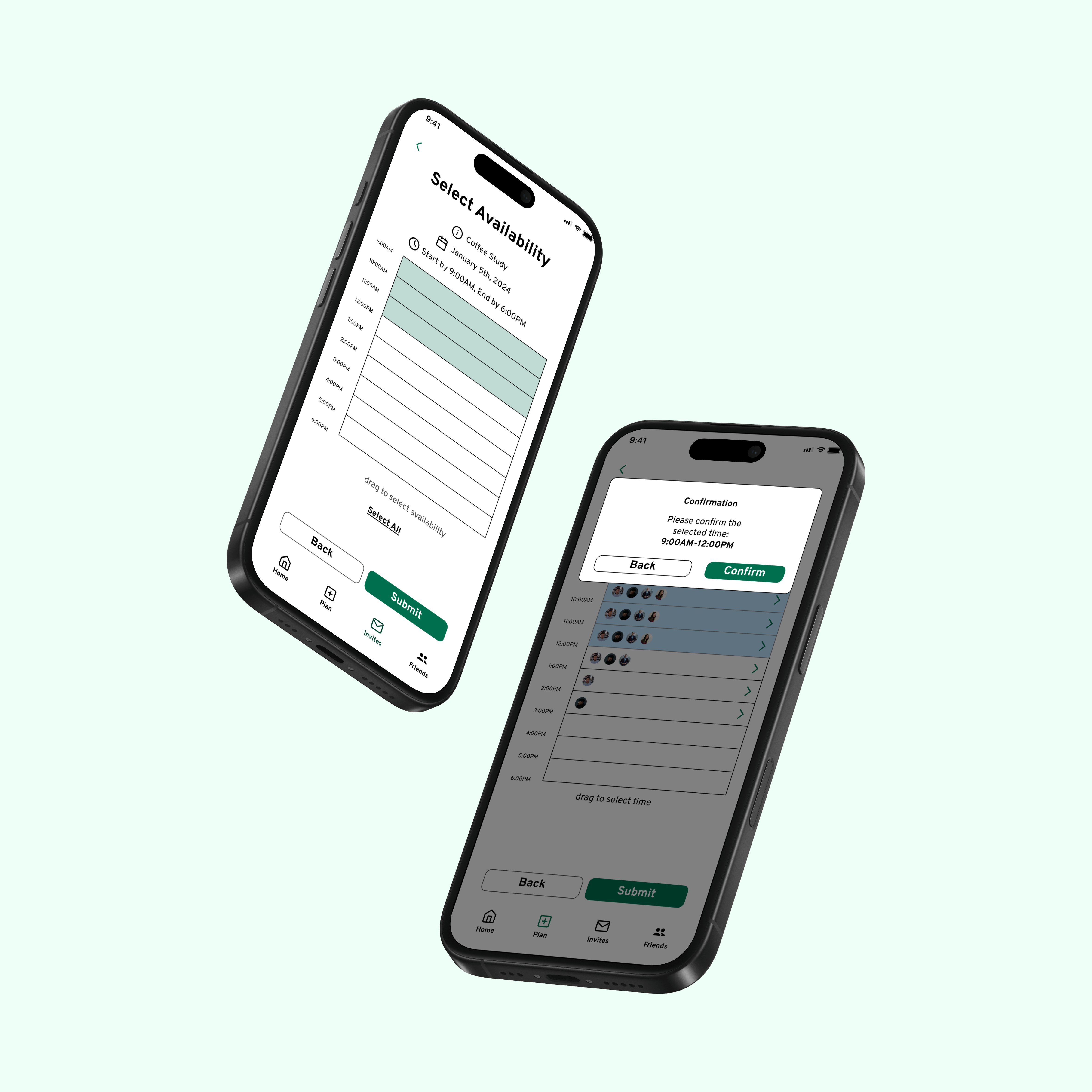
Through my research, I discovered that users struggled to create plans with friends due to not knowing everyone's availability.
Therefore, the core functionality of my solution allows:
1. Event Hosts to create an event with a potential time range
2. Event Attendees to submit their availability within that range
3. Event Hosts to then finalize the event time with the knowledge of all Attendees' availabilities
The host can create an event and give it a time range

Attendees then select their availability in the time range

The host can view all submitted availabilities

The host can then finalize the event time

After testing these solutions with potential users, I found that users
-Found it helpful to have visual indication of availability
-Appreciated the back-and-forth nature of sending and receiving availabilities
-Felt more comfortable planning events due to having a better sense of an attendee's status
To explore the problem space of event planning, I held 5 in-depth user interviews, opening with general attitudes towards event planning and then focusing on specific pain points.
I organized interview responses into an affinity board, focusing on the negatives to define my problem statement.

Something that stood out were the many frustrations regarding scheduling and responsiveness.
With the insights from affinity boarding, I created a user journey to follow the steps a user might take. From the journey map, it appears that the user experiences the most displeasure during the Assemble and Finalize phases.

Analyzing the affinity board, as well as interview responses, I was able to narrow in on a core issue, turning it into a problem statement:
Users expressed that hangouts were difficult to plan due to not knowing the availability of other prospective attendees, as well as the slow responsiveness of other attendees.
To make it actionable, I also framed it as a 'How Might We?' statement:
How might we help users have a clear idea of their friends' availabilities, as well as engage responsiveness?

I began brainstorming by sketching interfaces for a mobile device. I chose to design a mobile app because it seemed like the most common device used for communication within my userbase.
Following Jakob Nielsen's design principle of Consistency and Standards, I wanted to ensure that my solution incorporated many familiar aspects of a mobile communications app, such as a friends list. From there I looked to incorporate features that targeted my problem statement, such as event creation and various ways of indicating availability.
One product that really caught my attention was When2Meet. When2Meet allows an event host to enter a range of dates and gather availabilities from potential attendees, making planning a much more transparent process.


After solidifying my ideas for a solution, I created an information architecture to organize pages and flows.
I wanted the home page to show information that users would want to access the quickest, so I included upcoming events as well as any events that are still in planning. Originally, I was also going to have notifications and invites be separated, but after further deliberation, I found that they are too similar and would be better to be combined.
Overall, this structure attempts to streamline the process of event planning by minimizing unnecessary decisions and screens while maintaining expected features, which aligns with my goal.

In addition, I created two user flows, one for an event hoster and one for an event attender. These user flows illustrate the main two use cases of the product.


Putting my user flow and information architecture into practice, I started drafting low fidelity screens to illustrate the app concept. Things to consider included how many events I should show on the home screen, as well as the specificity of the notifications section (how I would split incoming vs outgoing invites). I also decided to add profile bubbles for attendees to easily illustrate availabilities.
Inspired by When2Meet, I wanted my app to focus on the transparency of availabilities, so I mocked up time availability and selection features.


Finally, after adding color and style, I created an interactable prototype, with the key flows illustrated below.


Event hosts can choose the event name, location, date, and time range, and send out invites to attendees.


Next, the invited attendees are prompted to submit their time availabilities within the range.


Once event hosts have recieved everybody's availabilities, the event time can be finalized.
I conducted a handful of Cognitive Walkthroughs, to test the app's usability, assessibility, and overall clarity.
Participants found that the app was useful, but did mention that it was quite a commitment to download an entire new app for planning. An interesting suggestion was to somehow create a shareable link for event invitations, reducing the need to download an app.
In terms of usability, the app was received positively. It was noted that although Plannit had more steps than a simple availability setter like When2Meet, it had a better sense of progression in the event planning process.
This project was a lot of fun, it felt great to own my own project and practice so many aspects of UX Design.
It was amazing that people expressed how my product could be helpful, reaffirming myself as a designer and pushing me forward with newfound motivation. I learned that the design cycle had a lot more bumps and hurdles than I expected, especially when working alone from scratch. It slowed me down at times, but it also strengthened my tenacity. I also was reminded how important it was to test your product, because sometimes even the most glaring issues might be missed due to having too few perspectives.
Overall, I grew so much as a designer and can’t wait for what’s in store next in my design journey.