

The Problem:
Task management is inherently difficult and messy, overwhelming users and causing stress.
The Goal:
To design a mobile solution that organizes tasks in a clean and simple manner through task chunking, progress tracking, and distraction removal.
Tranquility seeks to make the task management process much more manageable by thoughtfully and cleanly implementing interfaces and features that addresses key roadblocks for users.


To begin my exploration, I conducted five user interviews, asking them questions about how they manage their tasks. This step was vital in helping me empathize with my potential userbase. As this project had an accelerated schedule, interviews were a resourceful way to get rich qualitative insights.
The primary objective of these user interviews were to understand how users manage and complete their tasks.


My user interviews yielded a large amount of rich, qualitative insights. Therefore, it made the most sense to me to map these insights into an affinity board. By grouping interview answers into categories, I had an easier time uncovering patterns and key insights.
Through affinity mapping, I uncovered key, actionable insights, such as:
⭐Breaking down large tasks into smaller subtasks can make it easier to handle
⭐Simpler functionality is easier to navigate and use
⭐Good progression feedback and help push people towards finishing their tasks
⭐Mobile devices are full of distractions because of other apps, leading to delays and procrastination


My interviews made me realize something: people are really hard on themselves, even when they try their best, when managing tasks.
Interviewees encounter obstacles to successful task management, including distractions, decentralized apps, and lack of task specificity. But interviewees have also highlighted what works for them, including progress tracking, task chunking, and deadlines.
❓How might I design a mobile solution to address the fatigue of task management, by incorporating task chunking, limiting distractions, and invoking feelings of accomplishment?
Task management solutions are all over the market, so I decided to analyze competitors I felt were directly or indirectly solving my problem statement. By conducting a competitive analysis, I can understand the strengths and weaknesses of direct and indirect competitors. This will help inform me of opportunities I can capitalize on, while identifying pitfalls to avoid.
Direct competitors were Focus Keeper, Structured, and Forest, where their apps focused on both task creation as well as focused work sessions.
Indirect competitors such as Notes and Google Tasks featured a simple interface and quick checklist functionalities, while Asana had a plethora of task management features, such as task delegation, chunking, as well as a pleasing interface. Notion had amazing customizability and interviewees frequently brought it up, but it was a bit too feature-dense for my use case.

Based on my competitive analysis, strengths I wanted to capitalize on were:
🟢Allow users to create and chunk tasks
🟢Utilize a timed focus session to facilitate task completion and reduce distractions
🟢Feature a simple user interface with only essential functionalities, reducing clutter
In addition, pitfalls I looked to avoid included:
🔴An overly complicated user interface that was hard for beginners
🔴A feature-dense product that distracted users from their goals
🔴A simple checklist was not enough, due dates and chunking were essential to task management
Guided by the problem statement and informed by the competitive analysis, I began to brainstorm potential solutions and interfaces.
Some principles I kept in mind from earlier research were: task chunking, progression indicators, distraction-free modes, as well as positive affirmation.
I want to design a solution that is more than just for productivity: I wanted a solution that reminded people to take it easy on themselves, by making it clear that they are getting their work done.

As I was sketching and brainstorming, there were key design questions I asked myself:
🟡I wanted to emphasize and visualize daily task completion. How was I going to create a Home interface that showed tasks that users completed today while also allowing users to view and complete tasks for a different due date?
🟡I know I want a distraction-free, concentration-based mode. How can I elevate that mode from just a simple timer?
I kept these points in mind when refining my sketches into wireframes.

To visualize the user's experience as well as provide a framework for my wireframes, I created a user flow, capturing key functionalities of my app.
As illustrated in the user flow, my product's main functions will be task creation and task completion.
Instilling feelings of calmness, focus, as well as satisfaction, all back to the users. Tranquility felt like a fitting name.
Utilizing the User Flow as a guide, I created wireframes for the main features of my app. Rather than focusing on visuals, I put emphasis on functionality and flow, first validating whether my product made sense.


My fellow classmates provided feedback on my wireframes at this point, granting me direction on what's working as well as what's to be improved.
💬"The format of the concentration screens matches the function nicely - they're clean and uncluttered, allowing the user to focus on their task instead of getting distracted. Using the pomodoro method is a nice touch too."
💬"I see that you have a calendar already which is great but I think it could be really helpful to incorporate a calendar with colored dots by class on each date where assignments are due?"
💬"Question - for the subtasks, are the users able to add individual due dates? I can see that there's a "Finish by" section for the parent task, but sometimes it's nice to have milestones along to the way to ensure I'm on track. If you plan to build out the subtasks, that might be useful."
Keeping these points in mind, I continued on to create the visual direction of Tranquility through a design system.
A deep green and beige has been selected as the primary colors to provide a calming, natural feel. Buttons and components have been rounded to be more user-friendly and contributes to a less-rigid interface. Typography has been checked for color contrast, ensuring that readability is accessible and clear.


A simple and intuitive task creation interface allows users to organize what they have to do. Notably, many of the sections of 'Add Task' are optional, meaning that users have the freedom to organize tasks to their preferred level of detail.
User testing and peer feedback showed that users also preferred to add individual due dates for subtasks, which has been added as a feature.


On the concentrate page, users are able to set timers in order to focus on a selected task. This Pomodoro method-inspired screen aims to keep users accountable by providing a time block for productivity while also minimizing distractions.
Pausing is allowed, but can only be done if a user holds the button down, encouraging them to think twice before interrupting their concentration.
Breaks are incorporated in between concentration sessions to lower the buildup of mental fatigue.
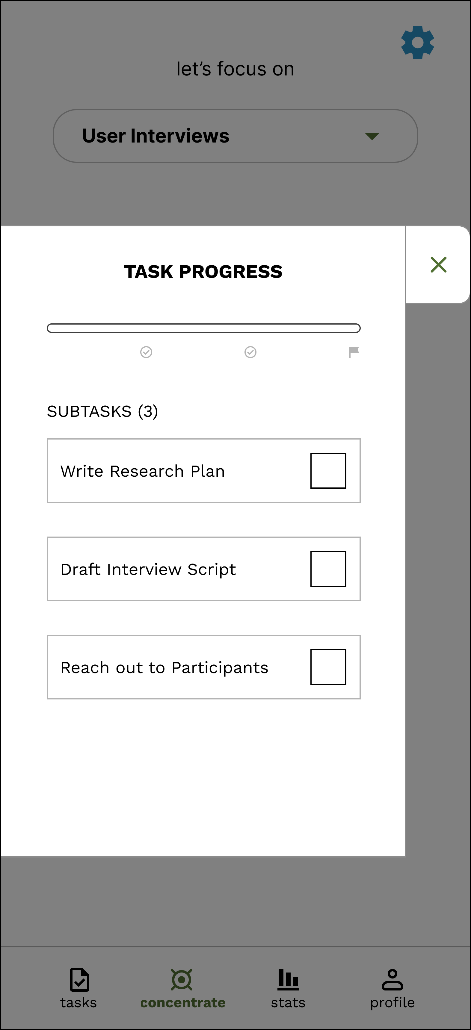
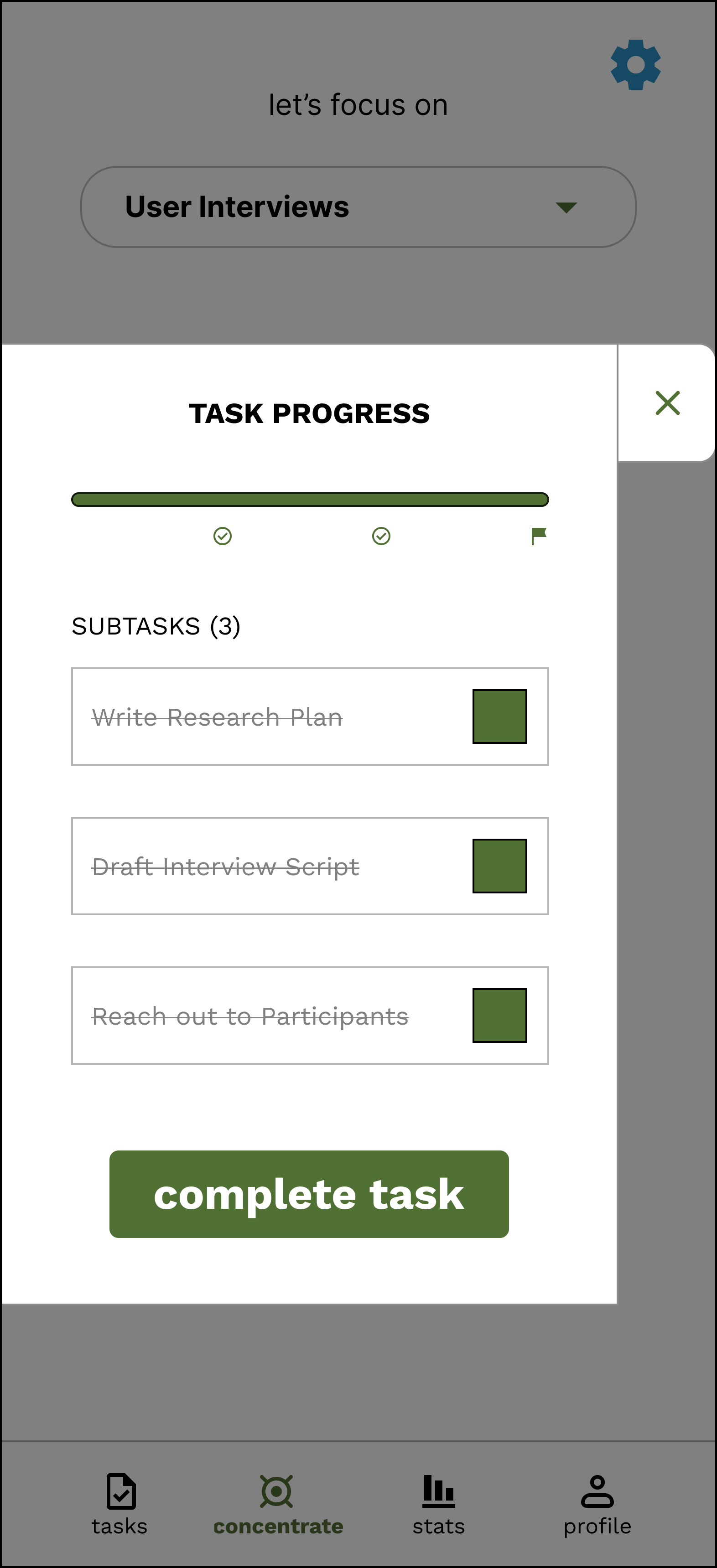


Alternatively, users can open the Task Progress overlay on the concentration page, allowing for progression by checking off subtasks. Progress is visualized through a progression bar, and completed tasks are shown crossed off.


Users can also view their metrics for task completion and concentration duration, reminding users of their productivity.
Concentration settings can also be adjusted to the user's preferences.
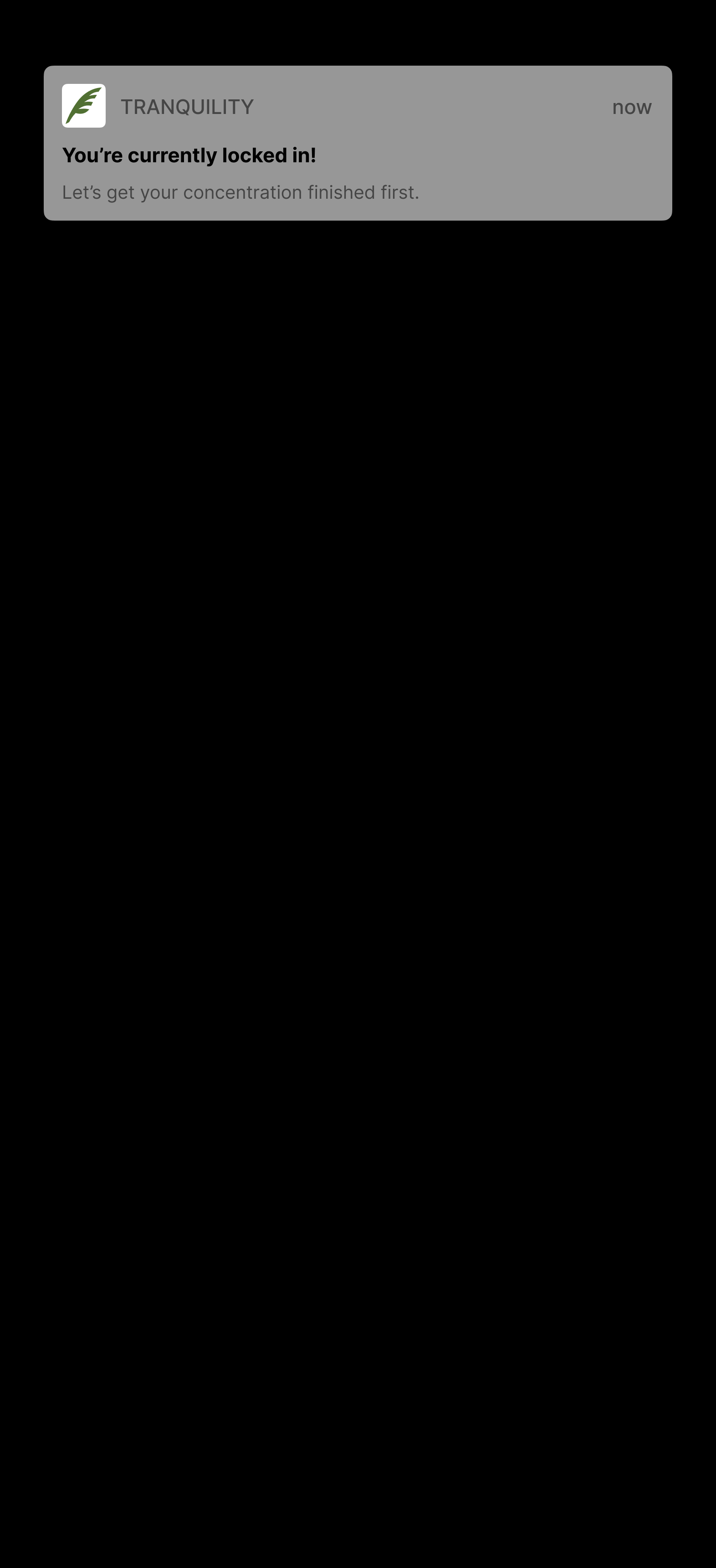
Finally, a notification will appear if the user attempts to use another application while LOCK-IN is enabled.
Peer feedback at this stage was positive, giving me confidence that I'm heading into the right direction for my product.
💬"Checklist sidebar tracking progression: I feel like it's satisfying! I love checklists and checking off tasks so it would motivate me. Maybe you can add a fun animation once a checklist is complete. Asana does this well."
💬"I think your design reflects the key functions really well. I like the uncluttered, spacious feel to your app and I think it feels really intuitive for me."
💬"Hi Jason!! I wish we could incorporate this into Canvas..!"
I then added interaction to my high fidelity screens bringing my product to life and providing a sense of how the interaction may feel to actually use.


With a functional prototype, I looked to evaluate the effectiveness of my design through semi-structured usability tests as well as guerilla testing sessions. Tests ranged from informal conversations while showcasing the app, to a semi-structured usability test complete with post-test questions.
User testing showed that Tranquility was effective in addressing the problem statement, with users even expressing how cool it would be to see Tranquility develop into a real application.
👍"I would say it was pretty straightforward, the experience is in line with what I expected of a productivity app."
👍"Likes the colors of the app, easy on the eyes. Likes how simple it is, and being able to use it offline would be cool"
👍"the animations! In a good way!" (when asked: Did anything surprise you about the app?)
👍"I liked that it allowed the user to feel in control and that there was a lot of things you could do on the app"
👍"There wasn't anything where it felt required. Like if I wanted to add tags, I could if I didn't want to, that was fine too"
Of course, there's always room for improvement:
🤔"Not being able to directly end the task." (when asked: What did you dislike about the app?)
I also received guided critique from my instructors, providing me concrete direction on how to improve my design.
📝"The add task page has reasonable options, but the page can be made more organized. Partly, the hierarchy isn't very clearly reflected by the elements. You can address this by making each heading more distinctive (e.g. larger, or smaller but bolder font, darker color) from nearby elements and/or specifying the boundary of each sub-section"
📝 "The nav/tab bar feels a bit too compact. It's okay to increase its height a bit."
Guided by user feedback and critique, I made improvements to the design.
The section labels have been redesigned, with a bolder weight, capitalized letters, and a smaller size to give it more distinction

The navigation bar's height has been increased

A button to directly end the task without having to go through individual tasks has been added to the checklist

Tranquility was able to address many of the key points in my problem statement, yet there was still more to explore. One aspect I wanted to better incorporate into the app was allowing users to feel like they deserved their rest time.
Therefore, I added a Daily Goals feature, with the goal that users will feel accomplished for the day once they reach their goals. This helps users feel validated to have some chill time, improving wellness and encouraging a tranquil state of mind.


Users can choose how many hours as well as which days of the week to enable the 'daily concentration' feature.
I've always had an interest in task management, and productivity as a whole, and this case study provided an incredible learning experience for me.
A major challenge with this project was that the task management problem space has been explored by many other products already, leading me to have to come up with creative yet user-centric ways to address my problem statement.
I've learned to incorporate user feedback and testing as frequently as possible, not just when there's an interactive prototype. By fitting in user feedback between as many steps of the design cycle as I could, I ensured that I continued to keep a user-centric mindset when making important design decisions.
In conclusion, this project allowed me to practice my research, analysis, and design skills in an accelerated yet effective manner. I'm looking forward to continually improving myself and bringing my skills into future project.

Designed with care by Jason
